.svg)
Every connected vehicle you run emits a stream of data: GPS pings, battery levels, speed, lock state, ride starts, ride ends. That telemetry is worthless until it changes a decision. The operators who make money are not the ones with the most dashboards open. They are the ones who can look at three or four numbers and know what to do next: which vehicles to move, which to pull off the street, which zones to seed, which riders to win back. This lesson turns your fleet analytics from a wall of charts into a short, repeatable decision loop.
The stakes are direct on Levy's revenue-share model. On the Managed plan you pay 20% of GMV (15% at 100 to 249 active vehicles on qualifying annual terms), with a $250 per month platform minimum credited against fees and $0 upfront. You pay when riders pay, so every point of utilization you unlock and every rider you retain is revenue you keep the operator share of. Analytics is included on every plan, not gated behind a tier, so the only thing between you and a data-driven fleet is knowing which numbers to read. New to the economics? Read what makes a scooter rental business profitable alongside this, then build the habit below.
Operating guidance, not financial advice
This lesson is operator-to-operator education on reading analytics, not financial, tax, legal, or insurance advice. Any utilization, revenue, or dwell-time figure here is an illustrative planning range that varies by market, season, vehicle mix, and how hard you run the fleet, so treat it as a number to model, not a fact. The only fixed Levy inputs are the published pricing: the revenue-share percentage, the per-vehicle rate, the $250 platform minimum, the white-label add-on, and the Stripe processing rate. Model your own numbers in the Fleet Estimator, and confirm tax, payout, and any downstream financial math with a qualified professional before you act on it.
Start with the metrics that move money
Before you open a chart, get clear on the small set of metrics that determine your profit and loss. Everything else is context. Vanity metrics (total rides, total riders, total miles) go up simply because time passes. The numbers below are the ones a decision hangs on.
| Metric | What it answers | Why it moves money |
|---|---|---|
| Rides per vehicle per day (utilization) | Is each unit actually earning? | Your single best proxy for asset productivity. Low utilization means you are paying to park inventory. |
| Revenue per vehicle per day | What does one vehicle bring in, all in? | Ties utilization to price. Two fleets at the same utilization can earn very differently. |
| Net revenue per ride | What is left after processing and discounts? | The number your fee, tax, and payout math all run on. |
| On-street availability | What share of the fleet is unlocked and rentable right now? | A charged, locked-out, or out-of-zone vehicle earns nothing no matter how high demand is. |
| Dwell time between rides | How long does a vehicle sit idle? | Flags dead zones, oversupply, and units that should be relocated or retired. |
| Repeat rider rate | Are riders coming back? | Cheap growth. A retained rider costs nothing to reacquire and lifts every cohort behind them. |
Two definitions keep this honest. GMV is gross rider payments before taxes, government fees, refunds, and tips: that is the base Levy's plan fee is quoted against. Net revenue per ride is what remains after discounts and after Stripe processing, and Levy's volume pricing is 2.6% plus $0.20 per transaction (versus a standard 2.9% plus $0.30), with your revenue share calculated on net revenue after those processing costs. Compare zones, days, or vehicle types on net revenue per ride and rides per vehicle per day together; one without the other lies to you.
Pick one north-star metric, then guard it
For most shared micromobility fleets, revenue per vehicle per day is the cleanest north star: it folds utilization and price into one number you can chart daily. Track it per zone and per vehicle type, watch the trend line more than any single day, and treat a sustained dip as a signal to investigate supply placement, pricing, or availability before it compounds.
Which dashboards and reports to actually open
Levy gives you real-time visibility as standard: GPS, remote lock and unlock, battery monitoring, speed tracking, geofencing, and real-time status are built into the operator dashboard for every vehicle. The trick is knowing which view answers which question.
The operator dashboard analytics
This is your daily driver. It rolls up rides, revenue, availability, and vehicle health across the fleet at a glance. Start here to answer "how are we doing right now and versus yesterday," then drill into a zone or a vehicle when a number looks off.
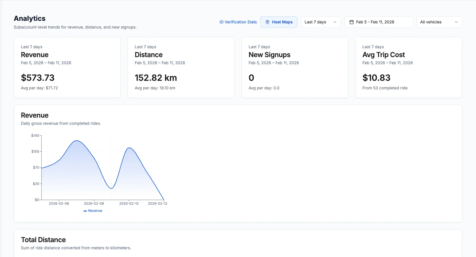
The demand heat map
The heat map shows where rides are actually starting and ending, so you can see supply drift as it happens: the corridors that empty out first, the transit exits where vehicles pile up, the edges of your zone where units wander off and sit. When utilization looks fine fleet-wide but riders complain about empty maps, this is where you find the mismatch.
AI Ops demand forecasting (paid add-on)
AI Ops is Levy's demand and rebalancing brain, available as a paid add-on with Starter, Pro, and Enterprise tiers. It does three things: it forecasts rides per hex zone over 1, 4, and 24 hour horizons conditioned on weather and local events; it turns that forecast into ROI-ranked rebalancing recommendations of the form "move N vehicles from hex A to hex B by time T, projected lift $X"; and in the operator app it plans battery-swap and rebalance technician routing jointly so one crew loop does two jobs.
AI Ops recommends and forecasts. It does not move vehicles for you.
AI Ops does not auto-execute moves, does not auto-dispatch crews, and is not a real-time engine (its smallest time bucket is one hour). It is not dynamic pricing or surge pricing, and it never changes your published rates. It hands your team a forecast and a ranked, ROI-scored move list. A human reads it, decides, and dispatches. Treat it as the analyst that finds the best moves, not the driver that makes them.
Reports and exports
When you need to go deeper than the live view, the reporting layer is where you pull historical detail, break numbers down by zone, vehicle, or period, and export for your own modeling. The ride history table is the workhorse: every trip with its status, distance, cost, and rating, exportable to CSV for the cohort and utilization math below. For the full catalog of what each report covers, see the fleet analytics and reporting help guides. Export a weekly snapshot so you watch trends over months, not just today.
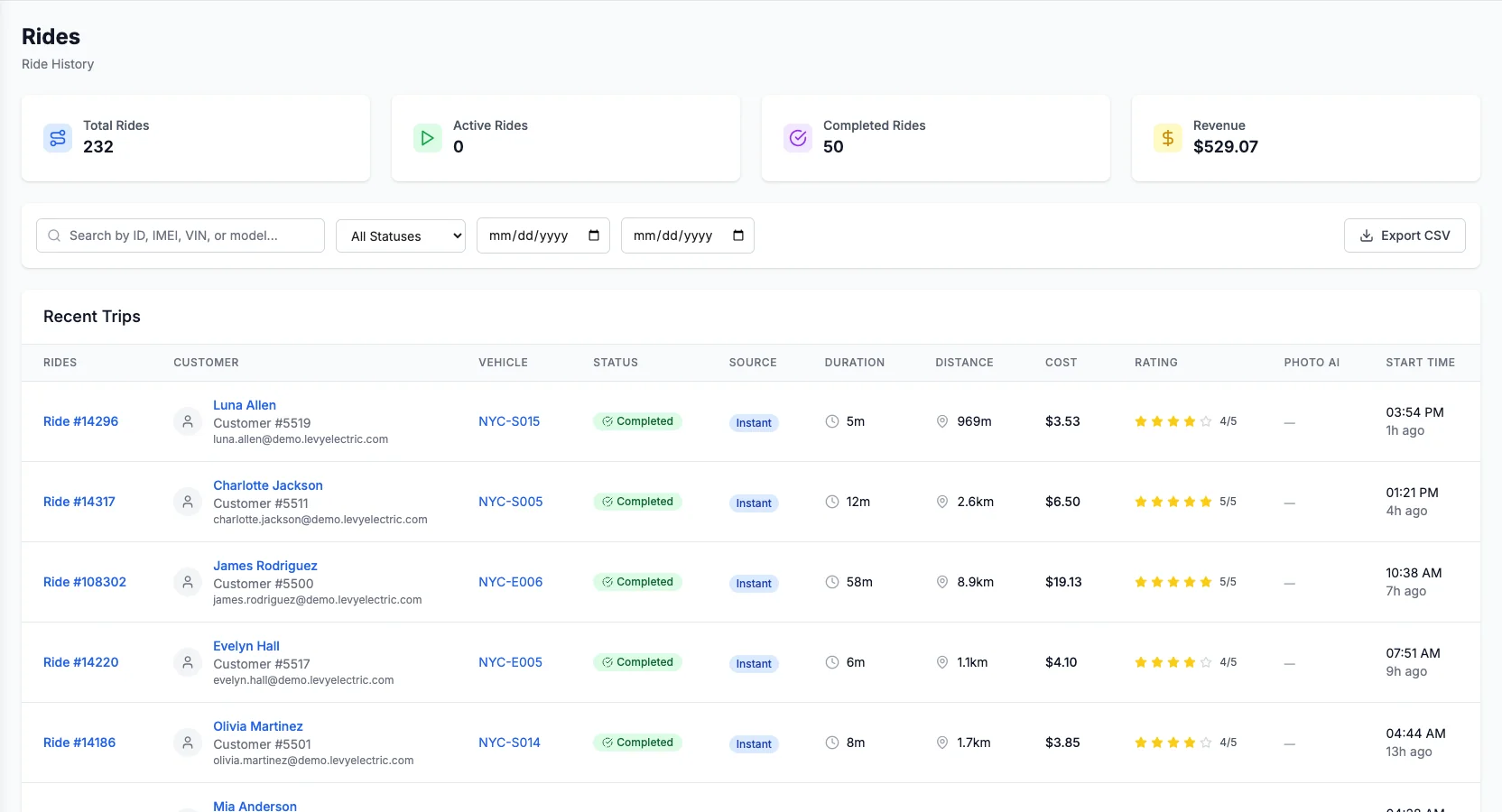
Utilization analysis: find the vehicles that earn and the ones that do not
Utilization is where most hidden profit lives, because the average hides the problem. A fleet averaging a few rides per vehicle per day almost always has a productive core carrying a dead tail, and your job is to find the tail. Rank your vehicles by rides over a trailing two weeks and look at the bottom of the list. The cold ones fall into a few buckets, each with a different fix:
- Wrong place. Healthy and charged but parked where nobody starts a ride. Relocate it toward a hot zone using the heat map, or nudge riders to end rides there with parking rewards.
- Cannot earn. Out of zone, offline, low on battery, or locked out for maintenance. Availability, not demand, is the constraint: cross-check battery and status telemetry and route it into battery-swap or work orders.
- Genuinely surplus. In a truly oversupplied zone, some units dwell no matter what. A vehicle that stays cold across many days and locations is a candidate to redeploy or retire.
Slice utilization three ways and the picture sharpens. By zone tells you where to add or remove supply. By hour shows a vehicle can be productive at 8 am and dead at 8 pm, so rank supply needs by time of day, not as a static list. By vehicle type tells you whether your scooters, e-bikes, and mopeds are each pulling their weight, since they carry different cost bases and demand curves.
Do not average away your dead inventory
Fleet-wide utilization is a comfort number; the money is in the distribution. If your top third clears several rides a day and your bottom third clears almost none, your real problem is a third of your capital sitting idle, and the average hides it. Always work the ranked list, not the mean.
Cohort and retention analysis: are riders coming back?
Utilization tells you whether your vehicles earn. Cohort analysis tells you whether your riders come back, which is the cheapest growth you will ever get. A retained rider costs nothing to reacquire and lifts every cohort behind them.
Group riders by the week of their first ride, then track how many ride again in each following week. Plotted out, that is a retention curve. Healthy fleets see it fall at first, then flatten into a loyal core: the height of that flat tail is your repeat base. A curve that decays to nothing means you are renting to strangers over and over and funding acquisition forever.
Read three things off your cohorts:
- Weeks to second ride. The faster a rider takes a second trip, the stickier they become. Most returns happening within week one means your onboarding is landing; a long gap flags friction.
- Repeat rate by cohort. If newer cohorts retain better, something you changed (pricing, coverage, availability) is working. If they retain worse, find what shifted before it compounds.
- Where good riders come from. The channel that brings riders who come back is worth more than one that brings a bigger one-time spike, even at a higher cost per install.
Then act on the cohorts. Levy's marketing automation lets you build audience segments and run lifecycle messaging and drip campaigns, so you can re-engage a lapsed cohort instead of paying to acquire a fresh rider. On the front end, a smoother first ride lifts every cohort behind it, and Rider Score (behavior-based safety scoring with rewards and interventions) is a lever to steer riders toward safer, stickier behavior. Retention is not a marketing afterthought; it is an operating metric you manage every week.
Reading demand: where the next ride wants to happen
Utilization and cohorts are backward-looking. Demand reading gets you ahead of the fleet instead of chasing it. The most expensive rides are the ones you never see: when a hot corridor runs empty, riders do not wait. They walk or open a competitor, and that lost trip never appears in your data.
Two views close that blind spot. The heat map shows the current mismatch between where supply sits and where rides start, so you can react today. AI Ops demand forecasting predicts where rides will want to happen over the next 1, 4, and 24 hours, conditioned on weather and events, so you can pre-position before the wave arrives. Weather is a real multiplier: a clear day lifts demand across the board while rain cuts it sharply. Do not seed for a sunny commute into a rainstorm.
The pattern to internalize: use history to learn your market's clock, the heat map to catch today's drift, and forecasting to place supply for demand that has not arrived. Reacting keeps you even. Forecasting is how you get ahead.
From dashboard to decision: a weekly operating loop
Analytics only pays off as a routine your team runs without you in the room. Turn the sections above into a weekly loop.
Open the week with the money metrics
Start each week on revenue per vehicle per day, utilization, and net revenue per ride versus the prior week and month. You want the trend, not the daily noise. Make anything moving the wrong way the week's focus.
Rank vehicles and clear the dead tail
Pull the ranked utilization list. Relocate the misplaced units, route the ones that cannot earn into battery-swap or work orders, and flag genuine surplus for redeployment. Fixing the bottom third moves the average more than optimizing the top.
Read demand and pre-position
Check the heat map for supply drift and the AI Ops forecast for the days ahead. Seed hot zones and origins before the peaks, and let parking rewards and the natural commute handle the drift you do not need to fund.
Check the retention curve
Look at your cohorts once a week. Is weeks-to-second-ride holding? Are newer cohorts retaining as well as older ones? If one is slipping, trigger a lifecycle campaign before it goes cold.
Score last week and tune next week
Compare what you did against what happened. Which moves cleared their cost? Which change lifted the number you were watching? Feed the answer into next week's plan so the loop sharpens every cycle.
By vehicle type: what to watch
The metrics are the same across your fleet, but the thresholds and failure modes differ by vehicle. Levy is hardware-agnostic across 30+ IoT vendors, so whatever mix you run, GPS, remote lock and unlock, battery monitoring, and real-time status let you read every unit the same way.
Kick scooters are high-volume and short-trip, so utilization is your headline metric and dwell time is your early warning. They cluster and drain in predictable spots (transit exits, the bottoms of hills), so read utilization by hour and by zone tightly. Because they are cheap to move in bulk, a dead tail is usually a placement problem you can fix same-day rather than a demand problem.
Frequently asked questions
Put it into practice
Good analytics is not about watching more charts. It is about reading a short list of money metrics, ranking your vehicles and cohorts honestly, and turning each read into one clear move: relocate this, retire that, seed here, win these riders back. Run the weekly loop, let the heat map and forecast keep you ahead of demand, and remember that on a revenue-share model every point of utilization and every retained rider is revenue you keep the operator share of. Want to see how these numbers translate for your city, fleet size, and vehicle mix? Model your fleet in the cost and revenue estimator and turn the metrics into a plan.